Branding • Concept
CAB 9 Snowboarding
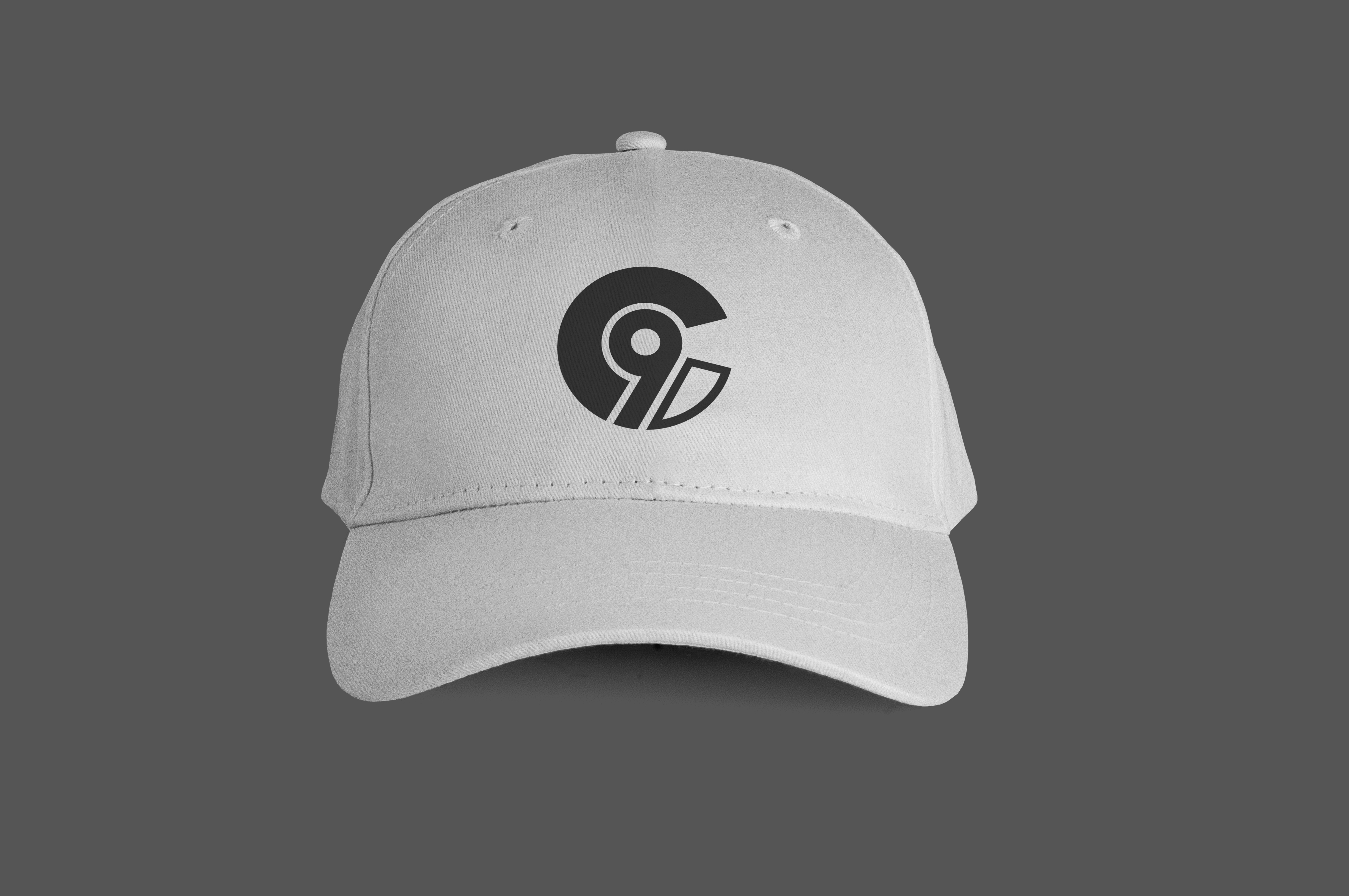
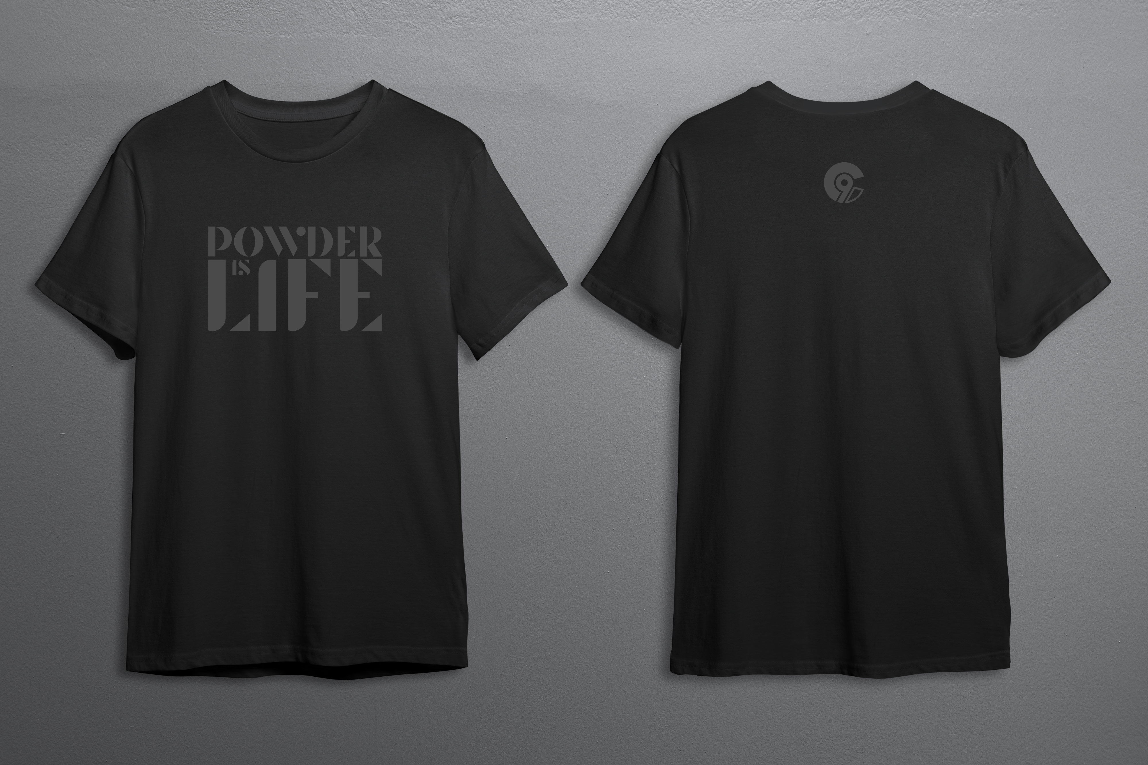
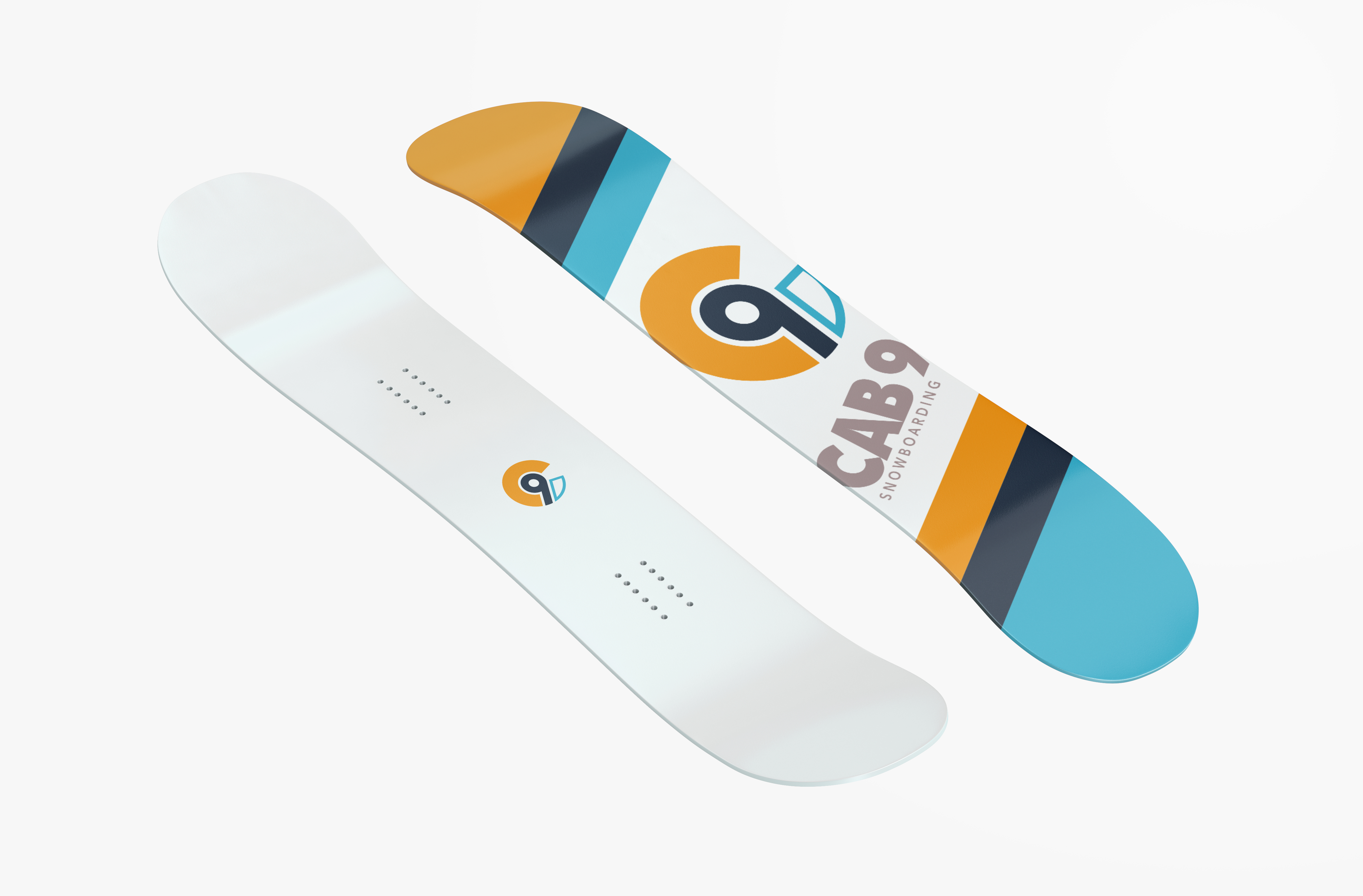
Named for a difficult snowboard trick, CAB 9 needed a strong mark that would be right at home emblazoned on stickers, shirts, hats, and snowboards. Taking inspiration from the trick itself, the stylized "C" and "9" elements combine to form a "dial" in rotation, and the bold weight and contrasting colours invoke the "seriously playful" snowboard culture. Due to these considerations, the CAB 9 logo mark looks at home on a variety of different kinds of apparel and products, and can be selectively matched with different fonts to communicate different brand messages.


