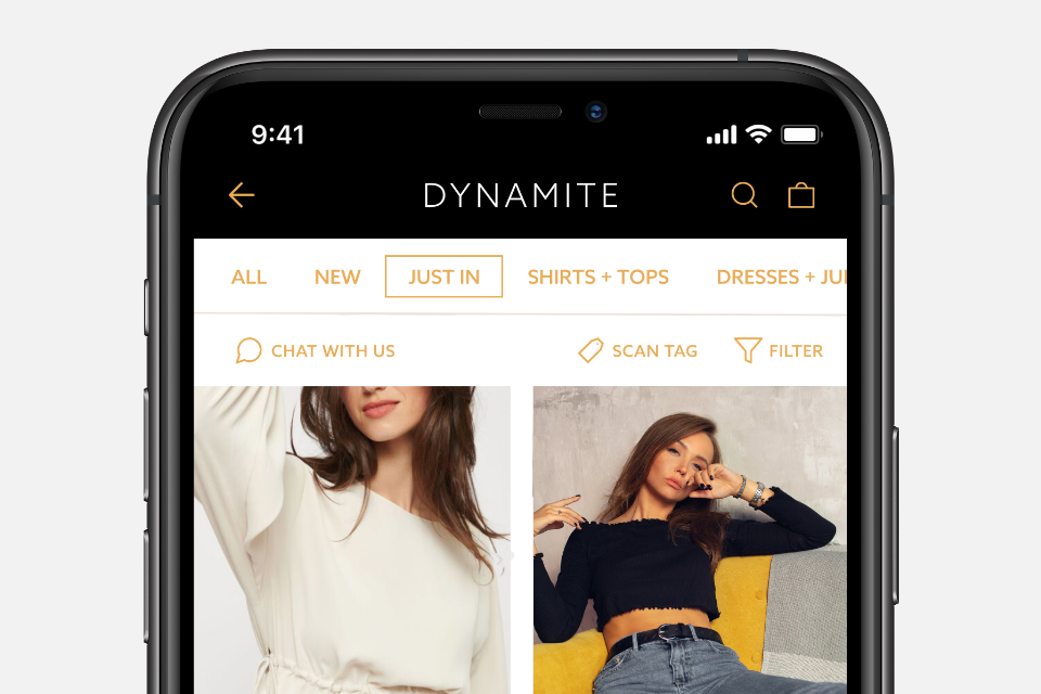
My wife loves the clothing at Dynamite, but often complains how confusing their app is to use. As a personal challenge, I took it upon myself to improve their interface with a better focus on usability and design. Dynamite, if you're reading this, I'd love to help you implement a new app!
View Concept
The brand for Enduring Heart had to present a welcoming simplicity while reflecting their uniquely diverse vision. More than just a Southern Ontario retreat centre, Enduring Heart also operates as a bed and breakfast, as well as a fruit grower and seller of farm-fresh baked goods. The 3 leafed tree emblem ties each of these focusses together and adapts seamlessly to each operation, while the modern/rustic logotype exudes their country charm.
View Brand Applications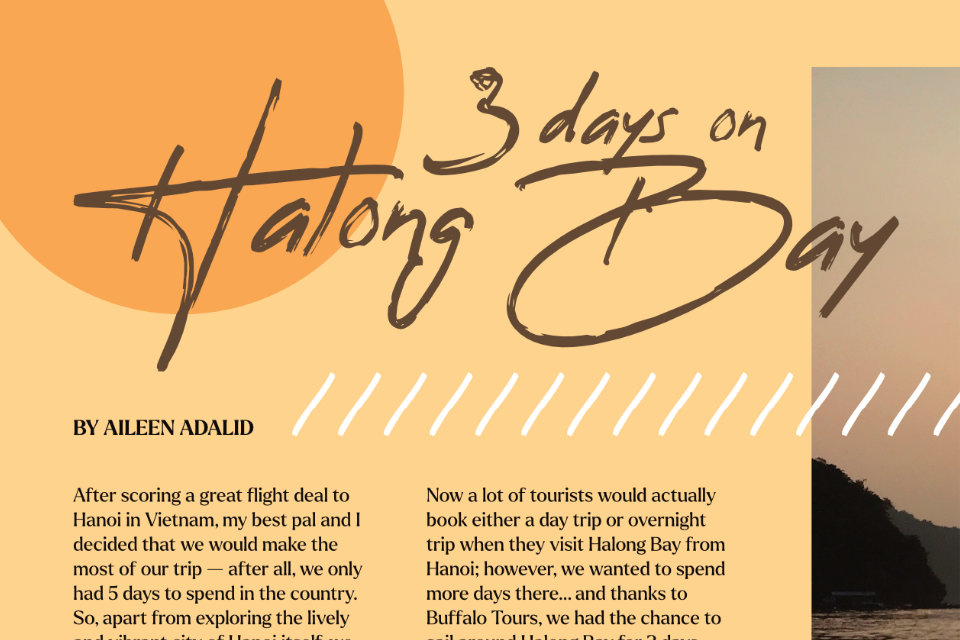
This mock magazine spread features photography from my personal travels, as well as my use of layout and photography to engagingly draw people into the article.
View Concept
The brief for the A•P•E Alternative asked for a logo that represented the core focus of the life coaching initiative: freedom from personal bondages. The client also wanted to communicate an "epic" and "adventuresome" tone to potential clients. The "broken cage" mark and gothic but modern lettering finishes a logo that meets the brief and stands out in the life coaching marketplace.
View Brand Applications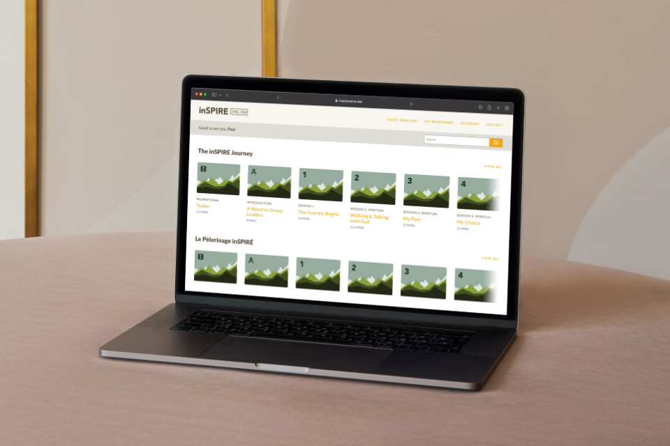
inSPIRE Online was designed and developed from the ground up as a bespoke streaming interface featuring the content from The inSPIRE Journey.
Note: This full piece can be shown in person to any that are interested in seeing it in more detail.
See More
Kaleidoscope Counselling is all about inviting and equipping people to see their lives and circumstances with new and healthy perspectives. Gentle colours inspire a relaxed and relational atmosphere, while the fractal form of the mark is reminiscent of the new perspectives seen through a kaleidoscope in addition to a deconstructed "box", which signifies freedom from old assumptions.
View Brand Applications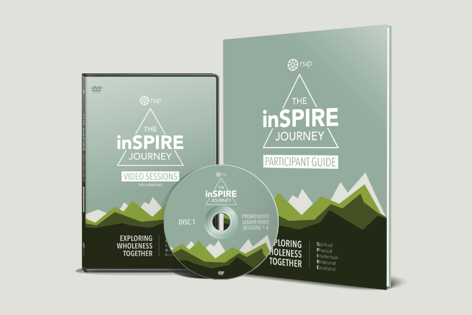
The inSPIRE Journey is a comprehensive learning package for groups and individuals focussed on wholistic growth, including a set of 15 video sessions, and a journal/workbook for participants.
See More
A brand concept inspired by a small apparel company started by a friend and I back in our early 20s. As a personal exercise, I decided to rebrand the now defunct company with a more modern aesthetic to see what it would have looked like had we started the company today.
View Brand Applications
An ad concept meant for magazine and large format poster placement for CAB 9 Snowboarding.
View Concept
Inspired by a Netflix show that my wife and I enjoy in which one of the characters owns her own bake shop, I wanted to see what a brand for that "modern" and "cute" bakery could look like in the real world. With the name of the bakery being a play on the phrase "A Fresh Start", I wanted to combine visual cues seen in a bakery with imagery that would also subtly communicate that phrase. The style and shape combination of the piece of fruit and cupcake silhouette in the mark are also reminiscent of a sun rising over a hill, which is a common image associated with new beginnings. Soft, playful pastel colours and a modern serif word mark complete the final look.
Many large cities are in a constant state of change. In the one I live, Calgary, it's not uncommon to drive through 2 or 3 construction sites of some kind on your way anywhere. Most of the branding for these companies don't seem to say much about the companies they represent, so as a personal project, I thought I'd see if I could improve on them. The letter mark for "Forge" takes a wide, bold, and sturdy stance, with letterforms that invoke construction materials without being too on-the-nose. Selectively seperating portions of the letterforms into separate elements creates the sense that they have been "forged" together. Metallic orange, grey, and navy blue colours create strong associations with on-site tools and vehicles.

When two dear friends decided to fulfill a lifelong dream of recording an album, they asked me to put a visual language to their words and music. Honing in on the central theme of joy from wishes and dreams coming true, a dandelion was chosen for its association with "making a wish", and all the possibility of the seeds that catch the wind when it is blown upon. The vibrant colours inside the dandelion shapes were hand painted with watercolour, then scanned into the computer to create a uniquely tactile final look.
RSVP is a non-profit organization with a history of creating and equipping small groups of women and men in their personal growth. Their identity had to communicate their vision to a more modern audience while accommodating a new perspective on video and print products. A circle of flames represents the groups in the organization, each sustaining a cycle of growth and sharing. The full cycle of flames resembles a flower, a symbol of life and vibrancy.
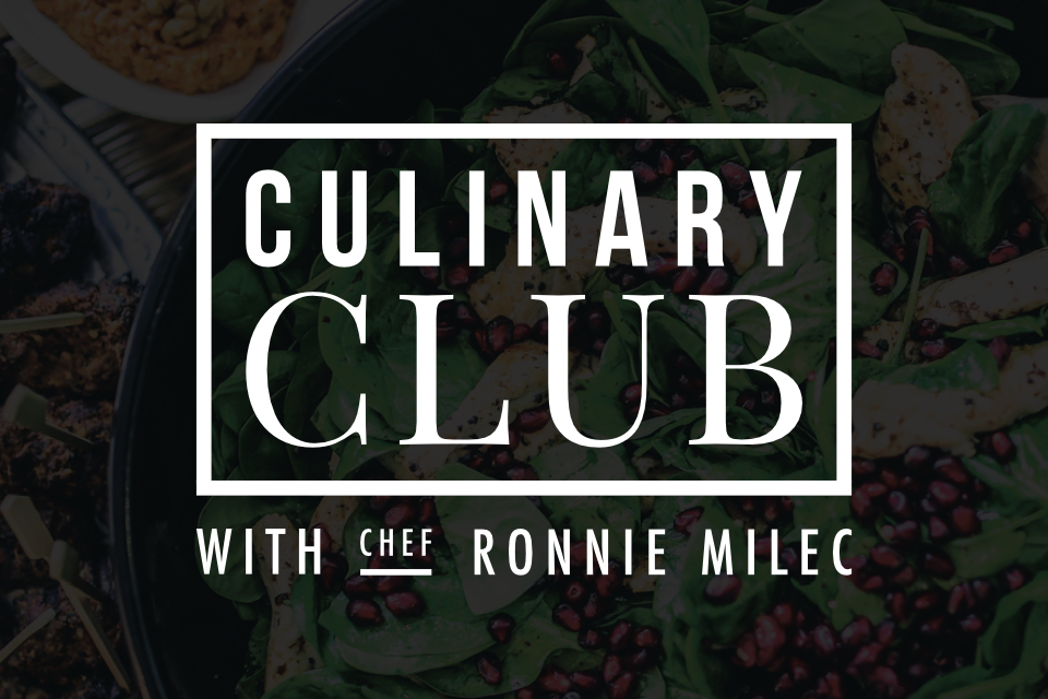
Conceived by a local YYC chef and friend as a monthly pop-up culinary experience hosted in people's homes, the vision of Culinary Club was to gather a community of people together to sample cuisines from around the world. Culinary Club needed an identity system that could be used to promote the changing menu for each event while remaining strongly identifiable and reflective of a respected culinary endeavour. Each month, the food was professionally photographed and overlaid with the letter-mark to highlight the wide variety of cuisines to current and future attendees.

These two travel films were conceived, shot and edited as a personal project while travelling in Asia. I wanted to see what I could create with minimal equipment, so both of these were shot with a handheld stabilizer, an iPhone, and attachable lenses. The goal was to give a quick but intimate feeling expose of each country.
Watch Films