Enduring Heart
Conceptual applications for the Enduring Heart brand strike a balance between rustic and modern, with elements that repeat across media to unify them under the Enduring Heart banner.
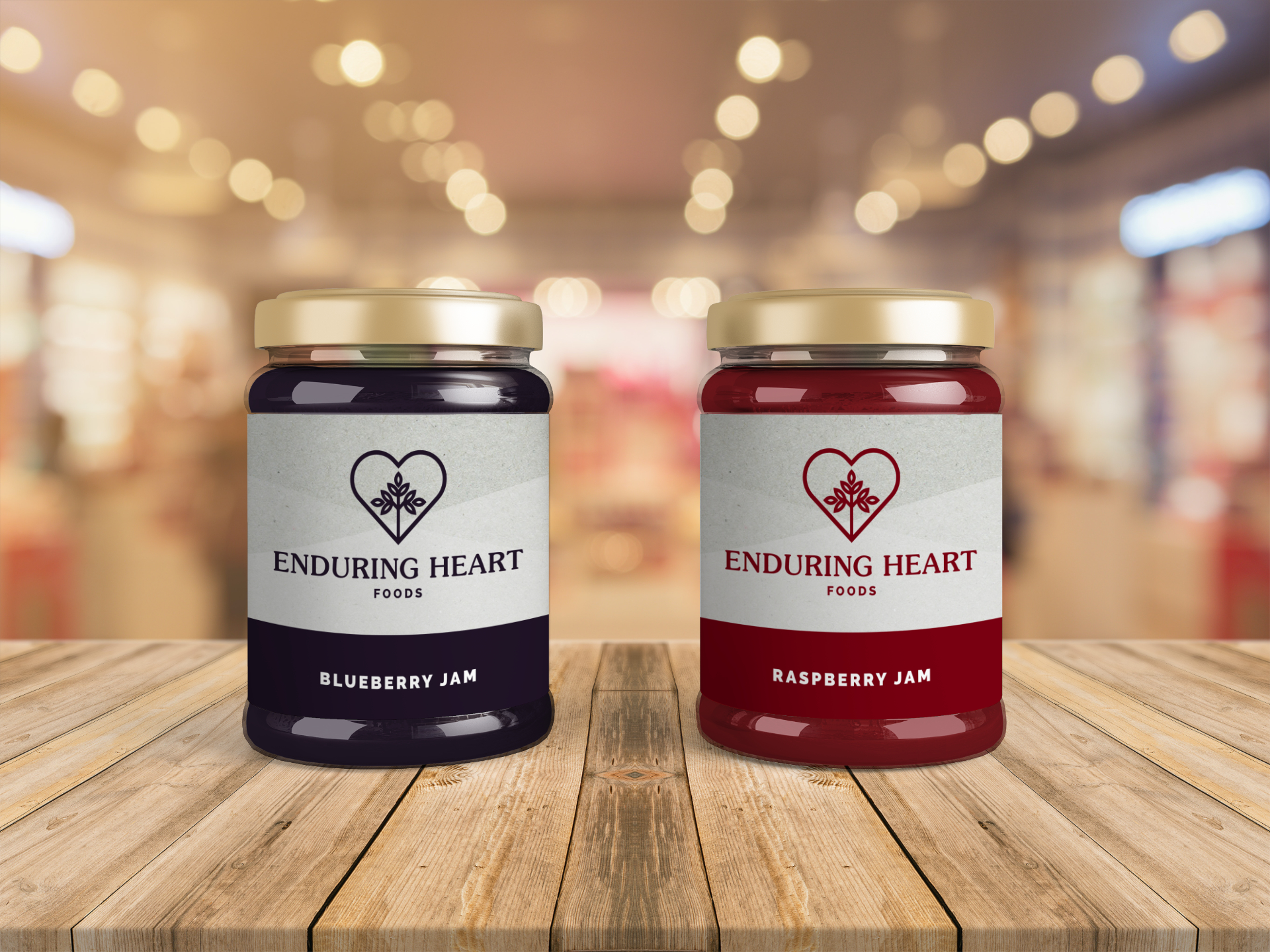
A worn paper texture is modernized by angular shapes to be used as a canvas for the mark and logotype on jam labels. Appropriate colours denote the flavour of each jam, along with complimentary typography.
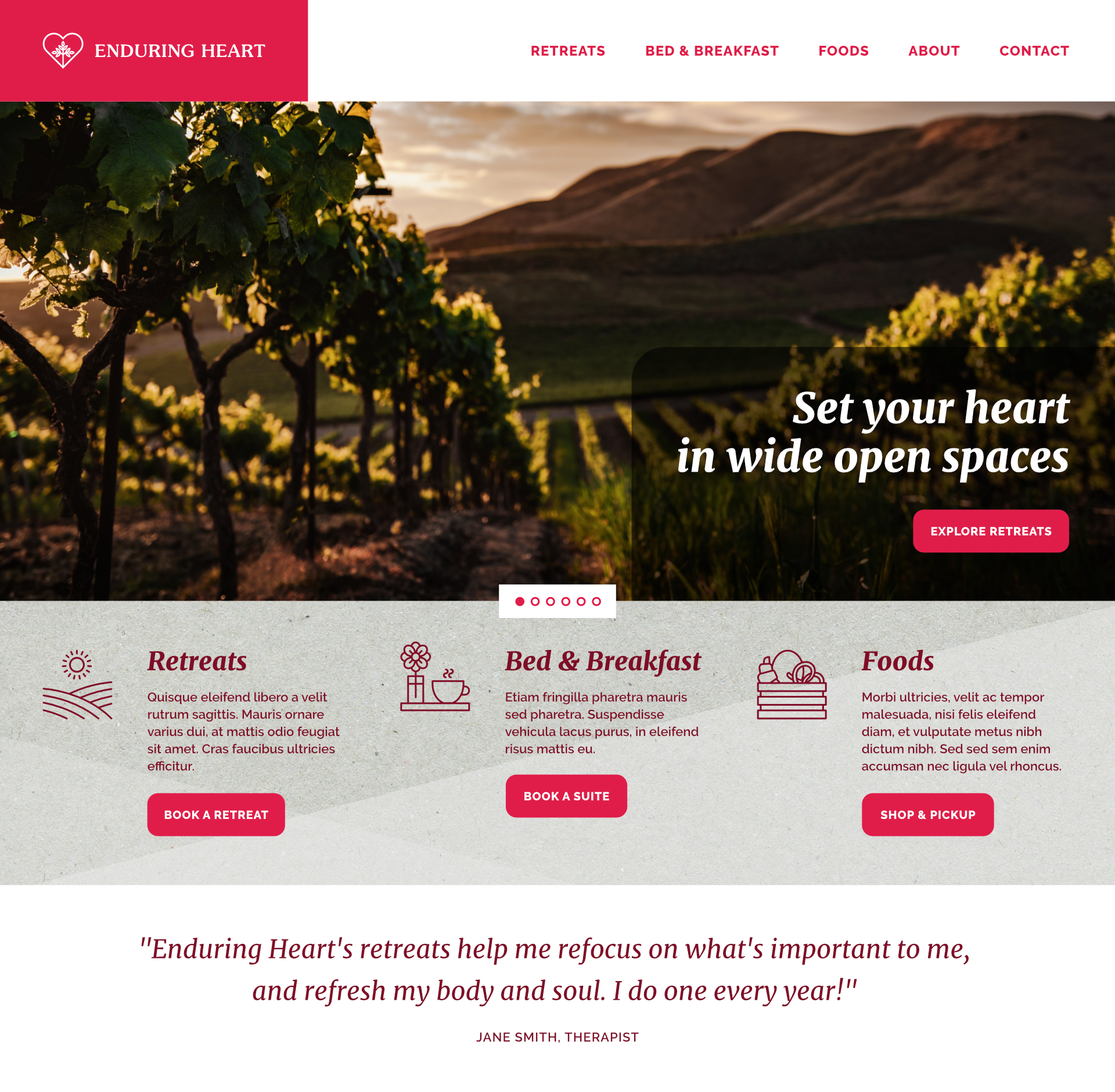
A website homepage concept drives home the overall focus of the brand, telling a story of recovery and refreshment in the country. Clear focus on each part of the initiative, clear call-to-actions, and customer testimonials help educate and sell the various experiences.
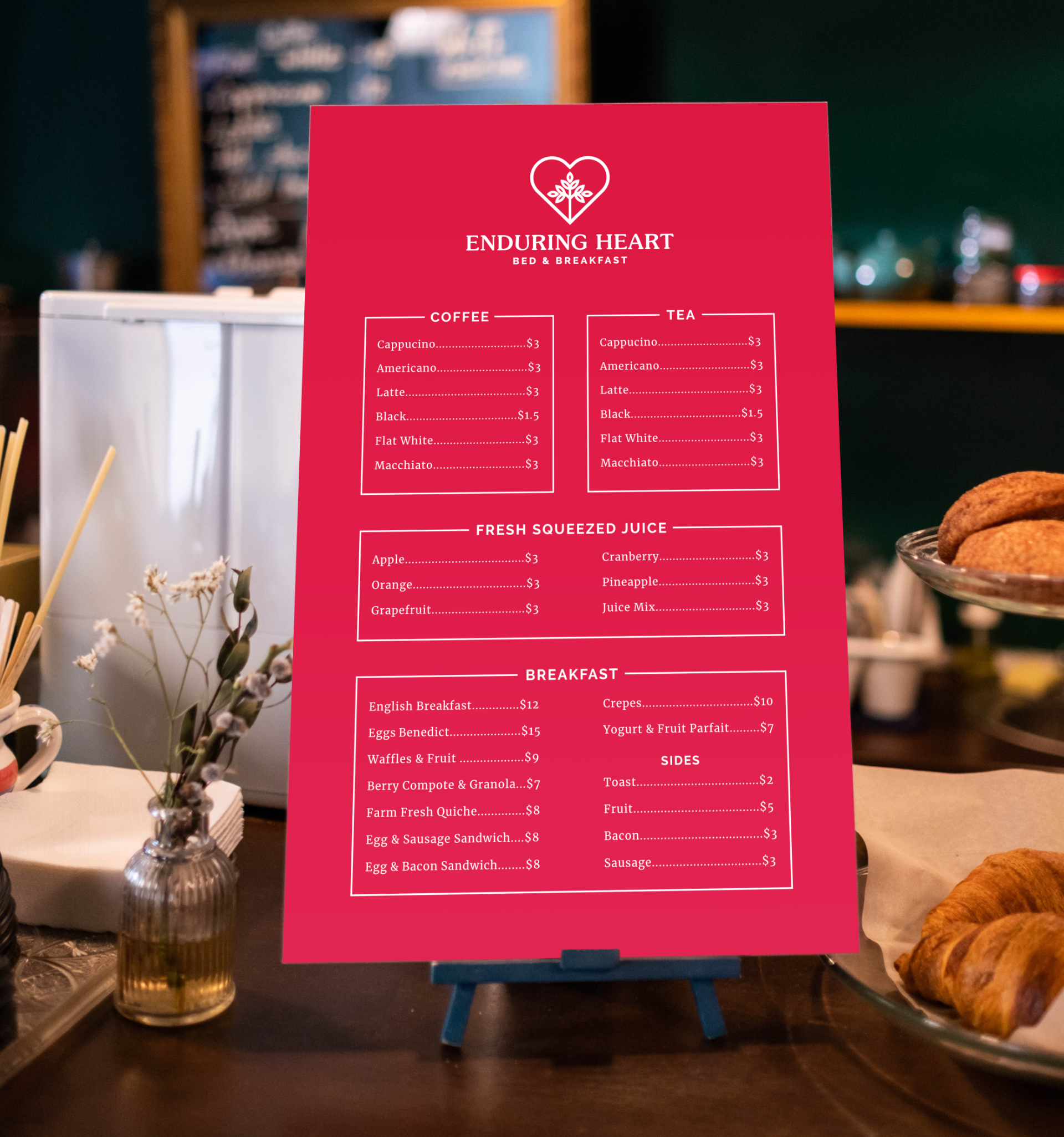
A bed & breakfast menu nestled amongst the various breakfast options uses complimentary typography to clearly present delicious farm fresh food options.
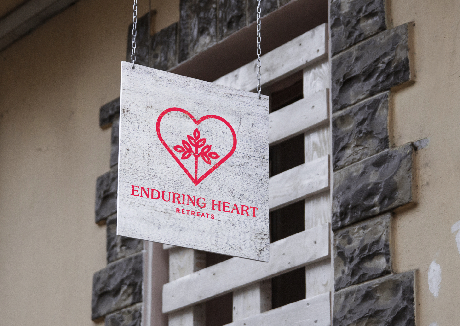
Continuing with the fusion of modern and rustic, conceptual retreat signage is printed on worn barn wood to compliment the country environment while at the location.


