Branding
Kaleidoscope Counselling
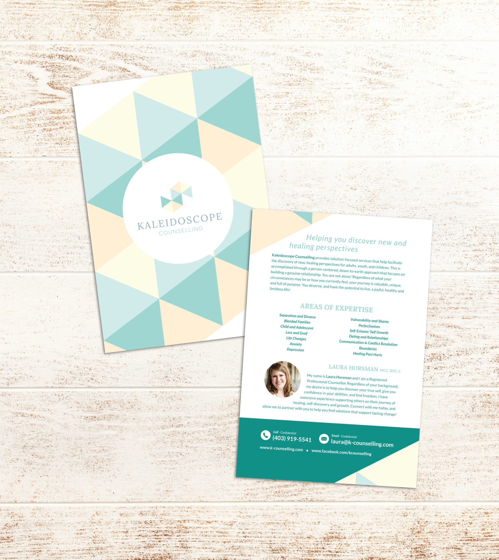
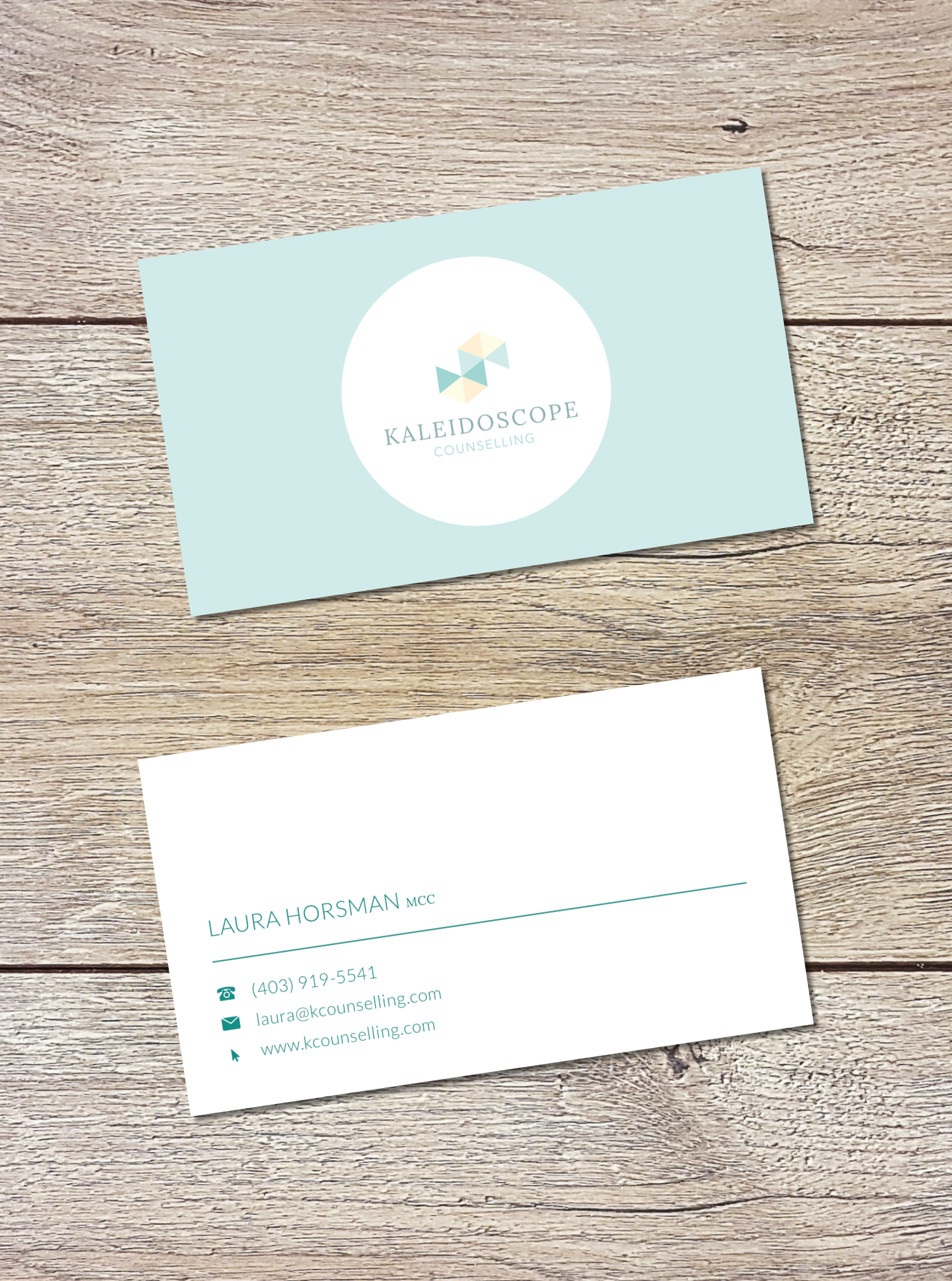
The client required 2 separate pieces for marketing her business. The first was a flyer that she could post on bulletin boards around town and hand out in person, and the second was a business card for networking.
The flyer leverages the fractal pattern inspired by her mark and bright but soft colours to grab attention. Information on the back is presented cleanly and legibly, with fonts that are soft and elegant.
The front of the business card highlights the mark with a simple, clean treatment, while contact details on the back are presented professionally and legibly.

